A multi-screen visualizer for website
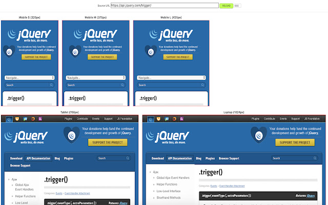
This is a work-in-progress version to see how a website will look in different resolutions. Currently 5 different screen sizes are supported:

* Mobile S (W:320px)
* Mobile M (W: 375px)
* Mobile L (W: 425 px)
* Tablet (W: 768px)
* Desktop (W: 1024px)

In near future, style updates to the UI and other features will be added.