Mobile View Switcher
「Mobile View Switcher」的項目標誌圖片

Mobile View Switcher

精選商品
3.5(

97 個評分

)
擴充功能工具100,000 使用者
項目媒體「2」螢幕截圖
項目媒體「3」螢幕截圖
商品影片縮圖
項目媒體「2」螢幕截圖
項目媒體「3」螢幕截圖
商品影片縮圖
項目媒體「2」螢幕截圖
商品影片縮圖
項目媒體「2」螢幕截圖
項目媒體「3」螢幕截圖

總覽

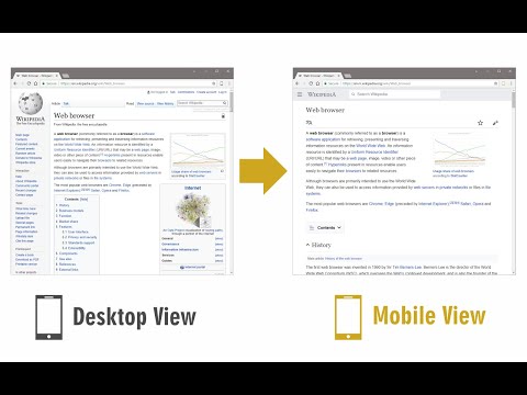
Switch to mobile view with one click via toolbar button.

Mobile View Switcher is a lite extension that let you switch a website to mobile view. Default mobile view is iPhone with iOS 15 but you can change it from the options page. Simply add a desired user-agent to change the mobile view to your desired one. There are many websites that offer user-agent strings for various devices. Simply copy and paste the desired one in the designated area in options page. Then reload any website to see the mobile view UI (while the addon is active). Toolbar button serves as ON|OFF switch to enable or disable the addon. Grey color for toolbar icon is when the addon is inactive and yellow color is for the active state. Simply click on the toolbar icon to switch states. To report bugs, please fill the bug report form in the addon's homepage (https://mybrowseraddon.com/mobile-view-switcher.html).

3.5 分 (滿分 5 分)97 個評分

Google 不會驗證評論。 進一步瞭解結果與評論。

詳細資料

  • 版本
    0.2.0
  • 已更新
    2024年1月18日
  • 提供者
    Benni
  • 大小
    34.33KiB
  • 語言
    English
  • 開發人員
    電子郵件
    benni.es@yahoo.com
  • 非交易商
    這位開發人員並未表明自己是交易商。歐盟地區的消費者請注意,消費者權利不適用於你和這位開發人員之間簽訂的合約。

隱私權

開發者已表示這項商品不會蒐集或使用你的資料。

這位開發者就你的資料做出下列聲明:

  • 經核准的用途外,不會將你的資料販售給第三方
  • 不會基於與商品核心功能無關的目的,使用或轉移資料
  • 不會為了確認信用度或基於貸款目的,使用或轉移資料

支援

如有疑問或建議,請前往開發人員的支援網站

相關項目

Mobile View: Test responsive designs fast

4.8(19)

Test your responsive designs on multiple devices at once.

Automate Your Bing Searches

3.6(246)

Automatically complete your Bing searches to earn Microsoft Rewards points.

Responsive View

4.2(14)

To view the page in different device screen sizes, just by a click

Breeze: Website Management Tool

2.9(8)

All-in-one tools for website migration project, operating website and SEO tools.

Mobile simulator - responsive testing tool

4.9(1873)

Smartphone and tablet simulator on computer with several models to test mobile responsive websites.

Responsive Viewer

4.5(241)

Show multiple screens once, Responsive design tester

Temporary Mobile View

2.6(8)

View current page in the mobile-friendly format by spoofing Android or iOS user-agent string on request header and JavaScript sides

Mobile Browser Simulator UserAgent Switcher

1.9(23)

Listens for changes to a DOM node attribute in a page and sets the browser's useragent according to the contents of that attribute.

Global Mobile

5.0(6)

Make all web pages display as they would on a mobile device

Mobrem

3.4(5)

Mobile browser emulator mainly for testing the responsiveness of web pages on various mobile screen sizes

Viewport Resizer – Responsive Testing Tool

4.2(265)

Responsive design testing tool to test any website’s responsiveness – it only takes 2 seconds! Emulate various screen resolutions.

Flexer

3.2(5)

Mobile/Responsive Web Testing for Front-End Web Developers

Mobile View: Test responsive designs fast

4.8(19)

Test your responsive designs on multiple devices at once.

Automate Your Bing Searches

3.6(246)

Automatically complete your Bing searches to earn Microsoft Rewards points.

Responsive View

4.2(14)

To view the page in different device screen sizes, just by a click

Breeze: Website Management Tool

2.9(8)

All-in-one tools for website migration project, operating website and SEO tools.

Mobile simulator - responsive testing tool

4.9(1873)

Smartphone and tablet simulator on computer with several models to test mobile responsive websites.

Responsive Viewer

4.5(241)

Show multiple screens once, Responsive design tester

Temporary Mobile View

2.6(8)

View current page in the mobile-friendly format by spoofing Android or iOS user-agent string on request header and JavaScript sides

Mobile Browser Simulator UserAgent Switcher

1.9(23)

Listens for changes to a DOM node attribute in a page and sets the browser's useragent according to the contents of that attribute.

Google 應用程式