Fixes a few UI elements for easy reading with InoReader
I made some enhancements to InoReader layout to make it match more with how Google Reader used to be. Feel free to make suggestions.
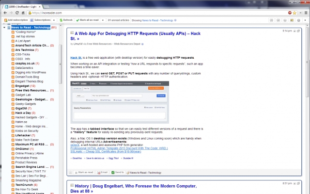
Feed navigation:
- Increase font size on feed
- Current feed indicator is more clear
- Unread count is in bold and red text, and is always aligned right
Reading pane:
- Widen content area a tad
- Increase title size
- Current title's is now red
- Unread titles are now blue
- Read titles are now black
- Article boxes now have even border widths and color