

Overview
FROONT is a web-based design tool that runs in the browser and makes responsive web design accessible to everyone
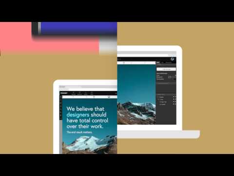
The multi-device age is here. The problem is, most people are still designing for all devices one-by-one in Photoshop. First you make the desktop version, then the mobile, then the tablet version. Existing visual editors for the web either aren't responsive, give little space for customization or lock you into templates. With the super user-friendly drag and drop interface anyone can create web design that works just as well on tiny mobile screens as on large cinema displays, no coding skills necessary. FROONT makes responsive web design visual. Design can be done in-browser with intuitive drag-and-drop tools. After all, humans judge design with their eyes therefore it seems just normal to see right away how designs will look across all different screen sizes. Each project has its own URL, that makes it easy to test the designs on real devices right away.
4.4 out of 58 ratings
Google doesn't verify reviews. Learn more about results and reviews.

Viesturs TeivānsJul 7, 2015
Great tool for creating responsive landing pages.

Pablo PetzenFeb 24, 2015
Great tool, thats puts adobe muse on recycle bin!

Edgars SirokovsOct 10, 2014
Really advanced yet simple enough tool! I love the instant preview - no more refreshing browser to see the changes I just made!
Details
- Version1.0.1
- UpdatedOctober 16, 2014
- Size10.37KiB
- LanguagesEnglish
- Developer
- Non-traderThis developer has not identified itself as a trader. For consumers in the European Union, please note that consumer rights do not apply to contracts between you and this developer.
Privacy
Support
For help with questions, suggestions, or problems, visit the developer's support site